How to draw graffiti bubble letters, step by step
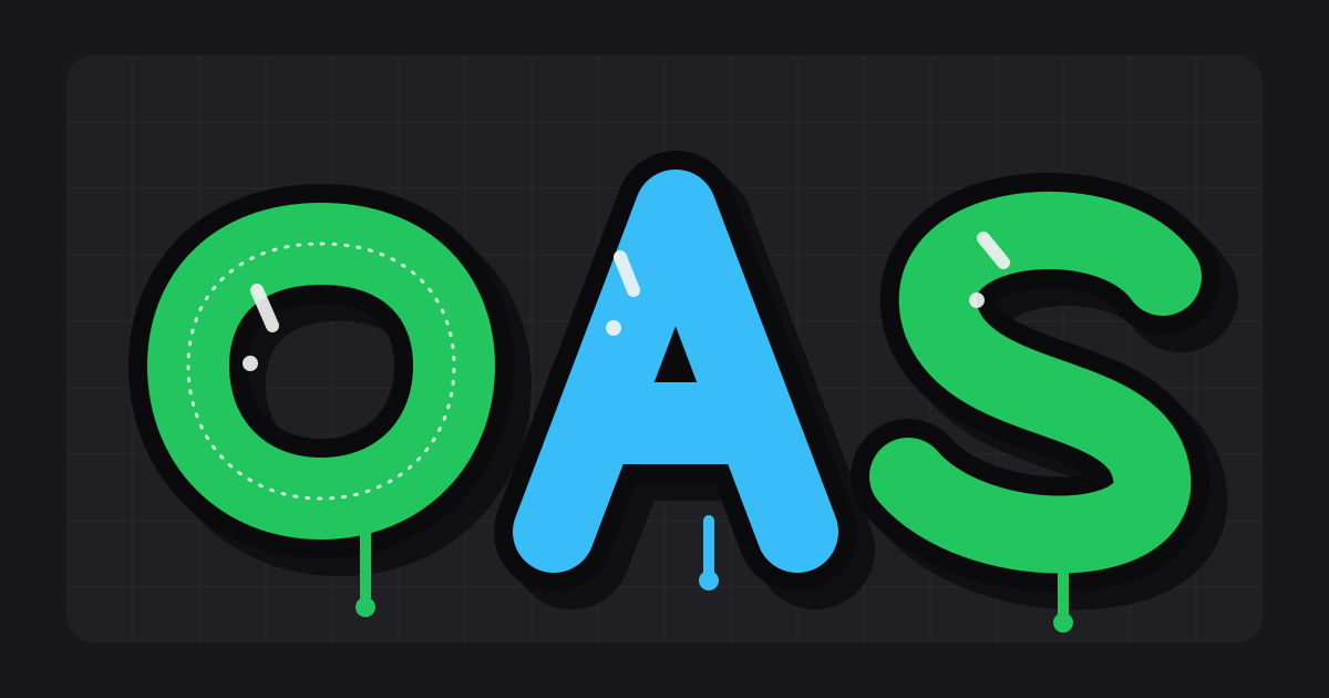
Graffiti bubble letters go wrong in the first thirty seconds, long before any colour goes on: a shaky skeleton cannot be rescued by a thick outline. I teach the order below to every beginner, and it works the same on a black-book page, a canvas or a legal wall.
Take the word NOVA. Four round, friendly letters make a good first throw-up, so I will use it as the running example, with real measurements you can copy onto any page.
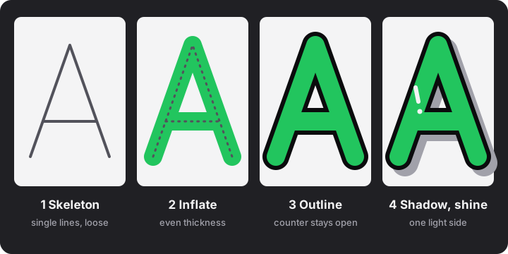
Draw the skeleton first, as single lines
Use a pencil and light pressure, one line per stroke, no thickness yet. The skeleton decides the rhythm of the word, which letters lean on each other and where every counter will sit.
- Space the letters loosely. Leave a gap of about half a letter between skeletons. You will close it when you overlap them.
- Vary the heights. Let the baseline bounce: N a little up, O down, V up, A down. Letters that all stand at one height read like typing, not like a hand style.
- Tilt one or two letters. Five to ten degrees is enough. More than that turns the word into a wave.
- Round every corner. A bubble letter has no sharp turns in its skeleton. Where a type font would use a corner, use a curve.
Inflate evenly around the line
Now add thickness on both sides of the skeleton, as if you were blowing air into a tube that follows the line. Keep the thickness the same on straights, curves and joins. Uneven thickness is the first thing a trained eye notices.
These proportions are my own rules of thumb, scaled from the letter height H. The example word is 12 cm tall:
| Part | Rule of thumb | At H = 12 cm |
|---|---|---|
| Fat stroke width | about 40% of H | 4.8 cm |
| Outline | about 4% of H | about 0.5 cm |
| Drop shadow offset | about 6% of H | about 0.7 cm |
| Smallest counter opening | at least a third of the stroke width | 1.6 cm |
Below roughly 30% of H the letter stops looking inflated. Above 50% the counters start to close. Stay between the two until your hand knows the shapes.
Keep the counters open
Counters are the holes inside letters: the eye of an O, the triangle in an A, the bowls of B, R, P and D. Inflate too far and a counter shrinks to a dot, then your outline swallows the dot and the letter turns into a blob. Check it in pencil before you ink. After the outline goes on, a counter should still be clearly open, which is why I leave that third of a stroke width.
If a counter is closing, you have two honest fixes: thin the stroke across the whole word, or draw the skeleton letter larger. Do not thin one letter only. The mismatch shows from across the street.
Overlap the letters in a fixed order
Throw-up letters lean on each other. Choose one rule and never break it: each new letter sits over the one before it, so the outline of letter 2 cuts across the fill of letter 1. Work left to right and erase the hidden part of the previous letter in pencil before you ink.
Overlap about 15% of a letter's width. For NOVA with letters 8 cm wide and 12 cm tall:
Word width = 4 × 8 cm − 3 × 1.2 cm = 28.4 cm
A4 landscape is 29.7 cm wide. With 1.5 cm margins on both sides you have 26.7 cm, so the word is too wide. The scale factor is 26.7 ÷ 28.4 = 0.94, which makes the letters 12 × 0.94 = 11.3 cm tall. Do this sum before inking, not after you run out of paper halfway through the A.
Outline, shadow and shine
- Outline: one steady line around the whole word, in black or the darkest colour of your scheme. Follow the outer silhouette of the overlapped letters, plus the line where one letter passes over its neighbour.
- Shadow: pick one direction (I use down and right) and offset a copy of the silhouette by about 6% of H. Use the same direction on every letter. The full treatment is in the guide to 3D letters and colour schemes.
- Shine: a short stroke and a dot on the lit side of each fat stroke, upper left when the shadow falls lower right. One or two per letter. Shine everywhere is just noise.
Tricky letters: E, K, M, R, S and W
| Letter | What goes wrong | Fix |
|---|---|---|
| E | The arms fuse into one block | Shorten the arms and keep the gaps between them open; the middle arm can be the shortest |
| K | The two diagonals mash together at the stem | Let the upper arm and the leg meet on the stem, not in mid-air, and round the notch between them |
| M | The middle strokes close both counters | Draw the V of the M shallow, ending about halfway down instead of on the baseline |
| R | The bowl closes and the leg collides with it | Make the bowl larger than you think, and start the leg from the bottom curve of the bowl |
| S | The thickness swells on the curves and thins at the ends | Draw the spine as one smooth line, inflate it as a tube, and keep both ends as thick as the middle |
| W | Four strokes crowd into a lump | Treat it as two overlapping Vs, with the middle peak lower than the outer tips |
Five beginner faults I see every week
- Uneven thickness. The stroke gets fat on one letter and thin on the next. Measure it with two fingers or a ruler on the first letter and hold that width.
- Closed counters. See above: thin the stroke or enlarge the letters.
- Same height, same angle. Everything lined up like a font. Bounce and tilt a little.
- A wobbly outline. Draw the outline in a few long pulls and turn the page instead of twisting your wrist.
- Copying someone else's letters. Taking another writer's name, letters or colours is called biting, and people notice. Use references to learn how letters are built, then change the shapes until the word is yours. The glossary of graffiti terms is a good place to learn the vocabulary.
A practice routine on paper
- Type NOVA, or your own word of three to six letters, into the graffiti generator, pick Throw-Up or Bubble Pop, and move the bounce, tilt and overlap controls until the word has rhythm.
- Print the outline-only sheet and trace it once in pencil so your hand learns the proportions in the table above.
- Take a clean sheet and redraw the word from the skeleton, without tracing.
- Change three things on purpose: the tilt of one letter, the end of one stroke, the position of the shine.
- Ink the outline, then fill with one colour. Two colours plus an outline is plenty for a first throw-up.
- Repeat with a new word each day for a week and keep every page in a black book. Compare the first page with the last.
Practise on paper, canvas or a legal wall. Painting on a wall without permission is illegal in most places, and it is buffed within days anyway. Ask the owner or find a permission wall in your town.
Once the letters hold together, the next question is which form you are making: see tag, throw-up, piece and wildstyle explained.
FAQ
How thick should graffiti bubble letters be?
I draw the fat stroke at about 40% of the letter height. Thinner than 30% stops looking inflated, and above 50% the counters begin to close.
Why do my bubble letters look like a computer font?
Usually every letter has the same height, the same angle and no overlap. Let the baseline bounce a little, tilt one or two letters and overlap each letter over the previous one by about 15% of its width.
Should I draw the outline first or the fill first?
Draw the skeleton in pencil first, then inflate, then ink the outline last. On a wall the order changes with the paint, but on paper this order keeps the proportions under control.
What do I need to start drawing bubble letters?
A pencil, an eraser, paper and a black marker for the outline. Add one or two coloured markers for the fill once the shapes feel steady.
Is it okay to copy a bubble-letter style I like?
Study how it is built, then change the shapes until they are yours. Copying another writer's letters or colours is called biting and is frowned on.