Graffiti 3D letters and colour schemes that read from a distance
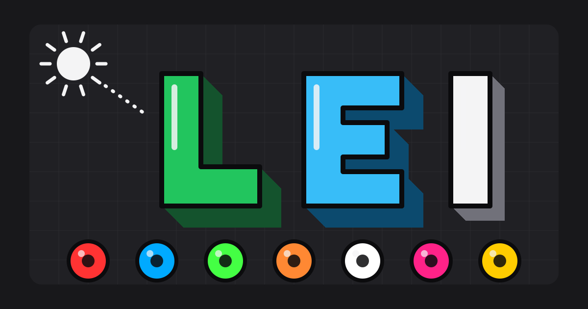
Squint at your sketch from across the room. If the letters melt into the paper, no amount of detail will save them from twenty metres away. Graffiti 3D letters and colour do one job together: they separate the word from its wall and from itself.
Two decisions carry most of it: which way the light falls, and how far apart your tones sit. Get those right and a three-colour piece beats a ten-colour one. I will give exact values below, so you can copy them instead of guessing.
Three ways to add depth
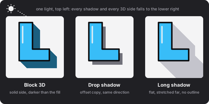
| Treatment | What you draw | Best for |
|---|---|---|
| Block 3D | A solid side that extrudes the letter along one diagonal, in a darker colour | Pieces and bold throw-ups; the classic look |
| Drop shadow | An offset copy of the silhouette behind the letter | Quick lift off the wall; fast throw-ups |
| Long shadow | A flat shadow stretched far across the wall, usually with no outline | Clean modern lettering with few colours |
For the numbers: the Block 3D style in a graffiti generator stacks copies of the letter, each one 1.4 px further along the diagonal, in the fill colour darkened by 55%. A 3D depth of 5 therefore reaches 7 px, and a depth of 20 reaches 28 px. On paper, I keep the block depth between a tenth and a fifth of the letter height. Deeper than that and the sides swallow the counters.
One light, one direction
The most common 3D fault is mixed light. One letter drops its shadow to the right, the next to the left, and the word falls apart. Decide the light before you pick up a marker: if it comes from the top left, every 3D side and every shadow goes to the lower right, and every shine mark sits on the upper left of a stroke.
To draw a block on a letter that is already outlined:
- Draw the face of the letter and its outline.
- Choose the 3D direction, usually 45 degrees down and right, and the depth.
- From each outer corner of the face, draw a short line in that direction, all the same length.
- Join the ends of those lines with lines that echo the outline of the face.
- Fill the side in a darker tone of the face colour.
- Outline the whole block in your darkest colour and erase the pencil lines that fall behind the face.
Four tones from one colour
A piece reads best when every colour has a small family: a highlight, the fill, a darker side and an outline. You can calculate them instead of mixing by eye. Per colour channel, with values from 0 to 255 and rounding to the nearest whole number:
darken(c, a) = c × (1 − a)
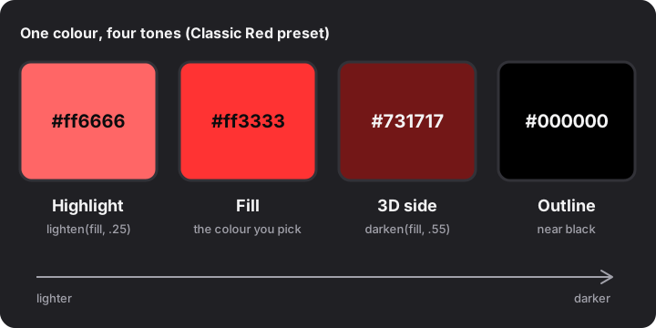
Worked example for the fill #ff3333, which is red 255, green 51, blue 51. The 3D side uses a = 0.55: red 255 × 0.45 = 114.75, so 115; green and blue 51 × 0.45 = 22.95, so 23. In hex that is #731717. The highlight uses a = 0.25: green and blue 51 + (255 − 51) × 0.25 = 102, so the result is #ff6666.
Five colour schemes with exact values
These are five presets of the generator with the tones derived using the formulas above. The last column is the contrast ratio between the fill and the preset background, using the web-accessibility luminance formula: (lighter + 0.05) ÷ (darker + 0.05). It is a convenient number, not a graffiti standard.
| Preset | Fill | 3D side (darken .55) | Highlight (lighten .25) | Background | Fill vs background |
|---|---|---|---|---|---|
| Classic Red | #ff3333 | #731717 | #ff6666 | #121225 | 5.1 : 1 |
| Ocean Blue | #00aaff | #004c73 | #40bfff | #0a0a28 | 7.5 : 1 |
| Toxic Green | #44ff44 | #1f731f | #73ff73 | #0a1a0a | 13.4 : 1 |
| Sunset Gold | #ff8833 | #733d17 | #ffa666 | #151015 | 7.9 : 1 |
| Mono White | #ffffff | #737373 | none (white cannot get lighter) | #000000 | 21.0 : 1 |
Mono White shows a rule worth remembering: you cannot highlight white. Leave the highlight out and let the grey 3D side and a strong outline do the shaping. In every row, the 3D side sits at least 3 : 1 away from its fill, which is enough to read as a separate surface.
Contrast for distance
Dark backgrounds are forgiving. Put the same fills on a pale wall and the picture changes completely:
| Preset | Fill vs wall | 3D side vs wall |
|---|---|---|
| Classic Red | 3.3 : 1 | 10.3 : 1 |
| Ocean Blue | 2.3 : 1 | 8.4 : 1 |
| Toxic Green | 1.2 : 1 | 5.4 : 1 |
| Sunset Gold | 2.2 : 1 | 7.9 : 1 |
| Mono White | 1.1 : 1 | 4.3 : 1 |
Toxic Green is a glowing 13.4 : 1 on a dark wall and a nearly invisible 1.2 : 1 on a pale one. That is why the same piece can look great in a sketchbook and vanish on a primed wall. My working rule: at least one of fill, 3D side or outline must sit at 3 : 1 or more against the wall, and the fill must sit at 3 : 1 or more against its own 3D side or outline. On a pale wall, the dark side and a heavy outline do the reading.
- Dark wall: light, saturated fills; 3D side mid-dark; outline can be black.
- Pale wall: keep the outline black or very dark, and make the 3D side the darkest colour of the fill family.
- Mid-grey wall: avoid mid-tone fills, because they sit at the same brightness as the wall.
Highlights, shine and fades
A highlight is the light colour on the lit edge of a stroke; a shine is the small stroke and dot that suggest a glossy surface. Keep both on the side that faces the light, and keep them small. Too many and the letter looks scratched.
A fade moves the fill from light at the top to dark at the bottom. A simple three-stop fade for Classic Red goes #ff6666 at the top, #ff3333 in the middle and #d92b2b at the bottom (darken .15). Three steps are enough: more bands look busy from a distance.
Test before you paint
- Squint test. Step back until the sketch blurs. You should still see the word.
- Black-and-white test. Take a photo of the sketch and turn off the colour. If two tones merge into one grey, change one of them.
- Wall test. Hold the sketch against the colour of the wall you will use. Check the fill, the 3D side and the outline separately.
- Paper first. Try the scheme on a small copy before you commit to a large surface.
Try the graffiti generator for quick colour experiments: pick one of the spray-cap presets, move the 3D depth, then redraw your favourite combination by hand. For the letter shapes underneath the colour, read how to draw bubble letters; to see where 3D fits in the ladder of forms, read tag, throw-up, piece and wildstyle. Keep it on paper, canvas or a legal wall.
FAQ
How do I make graffiti letters look 3D?
Extend a copy of each letter along one diagonal, fill that side with a darker tone of the face colour and outline the block. Use the same direction on every letter.
What is the difference between 3D, drop shadow and long shadow?
A 3D block adds a solid side to the letter. A drop shadow is an offset copy behind it. A long shadow is a flat shadow stretched far across the wall, usually without an outline.
What colours go together in graffiti?
A bright fill, a darker side from the same family and a near-black outline form a reliable base. Add one contrasting colour for the background or highlights.
How dark should the 3D side be?
A good starting point is the fill darkened by about 55%. For Classic Red #ff3333 that gives #731717.
Why does my colour scheme disappear on a pale wall?
Bright fills such as green, orange or white sit close in brightness to a pale wall. Let a dark 3D side and a heavy outline carry the shape instead.